
Why Adaptive Logo Matters: Lessons From 8 Smart Brands
With today’s wide range of digital and physical platforms, brands need identities that stay consistent and instantly recognizable. An adaptive logo offers a flexible solution, allowing your brand to remain relevant through simplified marks, color variations for different environments, and modular versions that adjust to any context.
Many brands have already proven how effective adaptive logos can be. Below are standout examples you can learn from to refine and future-proof your own logo for stronger branding.
Key Takeaways:
- Adaptive logo systems help brands stay consistent across varied platforms and environments.
- Scalable variations improve clarity from micro icons to large format visuals.
- Flexible brand marks support broader creative expression without losing identity.
- Modern adaptive logo practices align closely with evolving digital behaviors, ensuring brand identities remain responsive as interfaces, devices, and user expectations continue to shift.
8 Adaptive Logo Case Studies You Can Learn From
With many brands embracing this approach, it’s clear that it’s not just part of adaptive logo design trends but a long-term investment in staying relevant. These eight brands demonstrate how adaptive logos can be applied successfully and effectively.
1. Google

Google’s identity uses multiple permitted versions, so the mark reads clearly whether it appears on a laptop toolbar or an outdoor banner. The single G icon functions as a micro mark while the full wordmark appears when space allows, demonstrating practical logo adaptability across platforms without losing color rhythm.
This system shows how a layered identity maintains consistent recognition across products while enabling specific contexts to prioritise simplicity or detail.
Also Read: 10 Vivid Color Palette Ideas That Elevate Modern Branding
2. Spotify

Spotify uses a compact circular mark that stays clear at small sizes and while in motion. Its simple geometry ensures the icon remains visible on smartwatch screens, app menus, and social thumbnails.
Designers also apply color and contrast variations for dark mode and different marketing needs. This flexible approach keeps the brand recognizable across any visual environment.
3. Airbnb
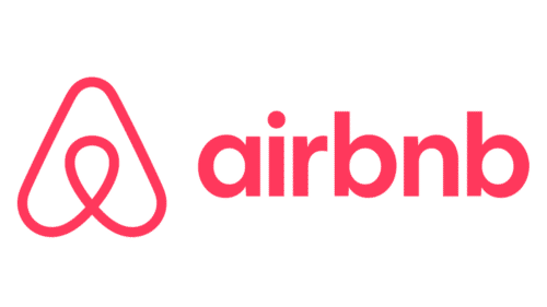
Airbnb built the Bélo to be both distinctive and versatile. It adapts easily across all product surfaces, pairing with the wordmark when space allows and standing alone as a friendly icon on mobile and map pins.
The brand occasionally applies localized or event-driven color variations, maintaining recognition while supporting cultural relevance.
4. Mastercard

Mastercard’s overlapping circles show how an adaptive logo can stay effective with or without supporting text. In tight UI layouts, the mark reduces to simplified concentric forms that remain instantly identifiable.
Monochrome and minimal versions are used when color printing or small-scale rendering demands clarity, proving that reduced complexity can still deliver a strong brand presence.
Also Read: Retro Futurism Design: Examples, Key Characteristics, and Best Applications
5. Dropbox

Dropbox implemented a modular symbol set that adapts by product line while keeping a common geometric foundation. Each variation signals a different service. It keeps the brand’s structural language consistent. This approach allows the brand to differentiate visually across offerings. It maintains an integrated brand family.
6. Netflix

Netflix pairs a bold N micro logo with a full wordmark for larger placements. The N works well as an app icon and as a corner badge on thumbnails, which keeps the brand visible in crowded UIs. This showcases how scalable logo design styles boost recognition in streaming and app ecosystems.
The system supports both promotional environments and tiny UI placements with consistent weight and spacing choices.
Also Read: 6 Essential Marketing Design Techniques for Effective Branding
7. Warner Bros

Warner Bros keeps its iconic shield silhouette consistent while adapting textures, colors, and treatments to match each franchise’s personality. The shield unifies the brand across film, television, games, and merchandising.
In certain executions, the logo shifts its tone to reflect different stories and genres, yet it always maintains a cohesive and instantly recognizable identity.
8. Mozilla Firefox
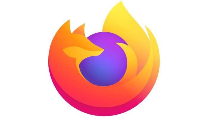
Mozilla created a unified icon system tailored to each product in the Firefox family. Every icon shares a consistent core structure, using simplified orbs and full emblems that work together across all digital touchpoints.
This system allows users to navigate smoothly across platforms because each icon adapts to specific screen sizes and device requirements without losing clarity or brand recognition.
Also Read: Vintage Style Logo Design Guide: Examples and Creative Inspiration
Are You Ready to Adopt an Adaptive Logo?
An adaptive logo is more than a design choice. It is a long-term investment in how your brand shows up everywhere your audience meets you. From modular layouts to thoughtful color systems, every detail helps build a flexible and memorable identity.
If you are ready to take the next step, start with typography. Clean, balanced, and versatile fonts keep your wordmark legible at small sizes and consistent across all variations.
For practical options and technical font solutions, explore the premium modern font catalogue at Eknoji Studio. It will help elevate your adaptive logo and maintain a strong visual presence across all platforms.
Comments